ANI GUEST EXPERIENCE
Delivering a new Explore feature to captivate new users and organically grow Ani's active user base
Overview
Ani is a social media start up targeted towards the anime, manga, and video game communities. In order to create a more inviting experience to the application, my team and I designed a new Explore as Guest feature for new users to preview parts the application without the need of an account while incentivizing account sign up through the progressive disclosure of the app.

Team
Role
Product Designer
Tools
Figma, Google Workspace, Notion, Slack
Time
March to April 2024
Context
The team I was assigned to for this project was tasked with creating a preview experience of the app for new users alongside redesigning the account creation flow. To keep it's brevity, I will be focusing on the preview experience for this case study.
Problem
Currently on our app, users are unable to explore the platform and try it for themselves to determine if they would be interested in what the Ani app has to offer without an existing account. This leaves a missed opportunity for us to capture intrigued users to engage with the app and eventually lead to converting an exploring guest into a signed-up user.
How we solved it
We designed for a dynamic element to be incorporated into different features of the app to block account required areas while still providing enough user exploration to consider signing up and offering them the option do so with ease. The elements copy and content would change in context with the feature it is in place for, sharing with users the benefits they get through creating their free account and providing them with a Call-to-Action to join the Ani community.
Process
Considering existing applications approach to a guests preview experience
While most other social media apps offer limited exploration, we looked to applications like Reddit, IMDB, Quora, and other community focused platforms to identify how businesses prompt users to sign up and create an account.
Other considerations we took into account outside of design elements included how we would introduce the new element into the existing architecture of the app. Some questions we asked ourselves to guide our final decisions to where we implemented our design solution included:
At what part of the user flow do we halt guest exploration?
What areas of the application require an account to access?
Will guests be allowed to interact with posts, articles and similar features by liking, reposting, commenting, and saving?
Our findings

We realized that most community forum applications kept to very similar paths of guest exploration until the user entered an area requiring an account.

Different variations of community forum applications' UI element consisted of similar pop-up patterns with little to no difference between them.
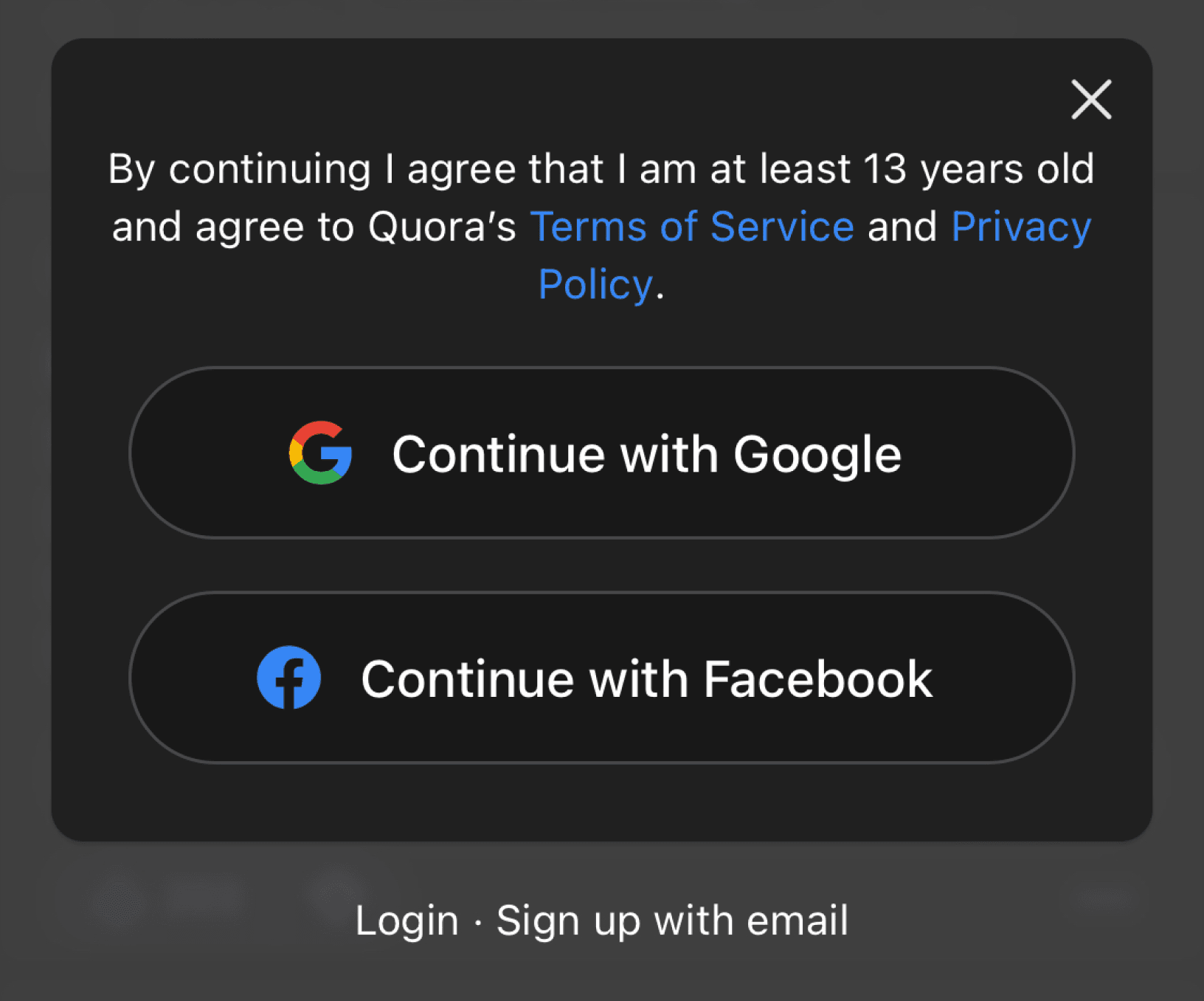
Instagram takes a thoughtful approach to persuading users to sign up. Based on the particular page a user is on, the copy of screen is tailored to the feature and what a user can expect from using it.


Instagram's mobile browser experience for users not logged in.
How are we going to persuade users to sign up from different interaction points across the application?
Solution
Making use of different design patterns to capture user attention while following Ani's design style.
While ideating, my team and I came up with variations of possible sign up design patterns that could best fit a variety of scenarios throughout the platform.
While we took into account what we learned from the community platforms we researched, we wanted to take advantage and personalize the opportunity to expose new users to Ani with the brand's unique personality.
That meant introducing captivating imagery to grab the attention of the user paired with short and effective copy to win a user over to fully committing to the app.
OPTION 1
Traditional half sheet for access to all sign up options.
OPTION 2

Full sheet with an immersive image, copy, and CTA.
OPTION 3

Full sheet with gallery to view all benefits of creating an Ani account.
Applying a mix of patterns to fit in any context throughout the user journey.
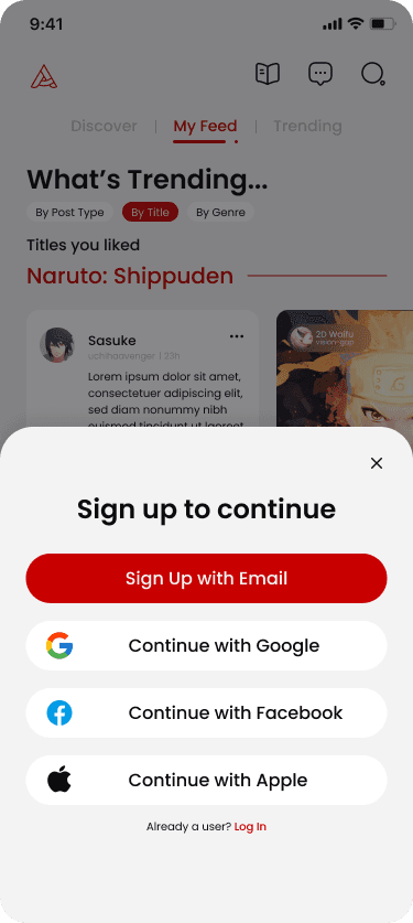
To get all of our bases covered, we chose to move forward with implementing Option 1 and Option 2 for all possible user paths a guest would reach and be required to sign in or create an account to have further access.
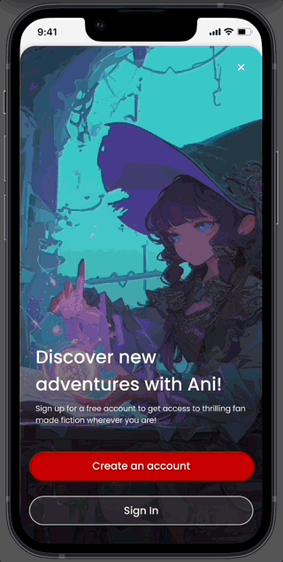
The sheet UI element was made as a template to allow for flexibility. The image and copy content were adjusted to relate to the feature being blocked behind them.
For example "Discover new adventures with Ani!" is for a Fan-fiction feature of the app, where users can read fan-made stories by creators on the platform.
A half sheet was used in in all other areas of the application which didn't require specific context to be shared.
This example shows what would happen when a guest would attempt to follow a user.

My team presented our solutions to the CEO and the development team that would be in charge of building our designs. It was brought to our attention that while they enjoyed the design choice of allowing users to sign in through Google, Apple, or Facebook (original design of Option 1), it would be difficult to implement due to time the scope of API integration and getting authorization from the respective companies. Therefore, we created the solution above which would direct to our sign up flow via email.
Next steps
Capture analytics of sign ups via new Explore as Guest option.
While we were unable to conduct ample usability testing on the feature due to the short deadline, we intend on gathering analytics to see how users are interacting with the new feature and to see if sign ups increase as intended in our original goal.
🔭
📈
Being able to see in what features guests are viewing that are leading to them singing up allows us to focus efforts on further developing and improving on those features. Conversely, for areas we see significant drop off we know to focus on understanding why users are leaving at that point and how we can readjust our templates content.
Learnings
My design process should adapt to consider timeline and scope of project for the best possible outcome.
Coming previously from a UX bootcamp background, I noticed that when working for a startup with a live product, there isn't always time to complete each step of the design process to a tee. Compromises have to be made in order to reach a targeted deadline to move onward to the next thing. Additionally, there comes the time when we do come back to a previous work and are able to assess its performance and adjust accordingly. Knowing what tools and methods are necessary to complete a specific project is crucial to providing an exceptional design solution that will benefit both the end user and the business.