CARDBOX VENDOR APP
Delivering a tool to let Pokémon Trading Card vendors track sales and inventory, faster and smarter.
Overview
What started as a hobby quickly turned into a deep curiosity about the systems behind the booths. After attending several collectible card shows, I realized vendors had no real tools built for them - only makeshift systems to log sales, track prices, and manage what they brought. My cofounder along with myself set out to change that by designing and building a mobile-first app that helps vendors stay organized, make better deals, and save time on the floor.


Team
2 Founders
Role
Product Designer (UX/UI, User Research, MVP Scope)
Tools
Figma, Bubble, Framer, Discord
Timeline
1 month
01
Context
After getting more involved in the Pokémon TCG (Trading Card Game) scene, I found myself regularly attending card shows. While walking the floor, I noticed a consistent pattern – vendors manually writing down sales, snapping photos of the sale, or even recording full videos to remember what left the table. Inventory was tracked in spreadsheets, and pricing had to be constantly re-stickered from show to show.
02
Problem
Vendors face a chaotic environment with no way to:
Log transactions (especially lots or trades)
Track what's brought to shows vs what sells
Adjust pricing based on live comps
Analyze their performance over time
Current solutions are either cobbled together (Google Sheets + photos) or don't work offline, on-the-go, or in a card show context.
03
How we solved it
We designed and built a no-code MVP of our app that solved just the core need of our vendors: fast, in-show transaction logging - no spreadsheet juggling, no delays, no guesswork. From there, we created design iterations for a more refined version of the app, shaping a vision for what the full product could become.
Timeline
How we moved fast (and stayed focused)
WEEK 1
Discovery & vendor research
→ Talk to vendors, validate pain-points, and define a clear use case worth solving
WEEK 2
Built and tested MVP in Bubble
→ Launch a working MVP using no-code tools
WEEK 3
Designed final app flows & UI
→ Use feedback to improve UX and define a more polished mobile app version
A clear goal for each week kept our momentum sharp and our priorities aligned.
Process
We found that vendors waste time and risk errors manually tracking sales and inventory during shows
After attending a handful of trading card shows, I wanted to validate my assumption that vendors were struggling to track sales efficiently. Rather than jumping straight into building, I started having casual conversations with 20 vendors at their booths. I approached them as a fellow hobbyist and buyer, which made the conversations feel more natural and open.
Questions for Vendors (& most common replies)
🧠 Understanding their work
“Can you walk me through your process for getting ready for a show like this?”
“How do you usually keep track of what you bring and sell?”
“Do you use anything specific to manage your inventory?”
📦 Inventory & Pricing
“What’s the hardest part about managing your inventory?”
📉 Pain points & gaps
“What part of doing shows is the most frustrating or time-consuming?”
“Have you tried any inventory or sales tracking apps before? Why or why not?”
💬 USER INTERVIEW STATS & RESPONSES
90% Tracked sales manually and post-show
100% use some sort of spreadsheet tool to track inventory/sales
All adjusted pricing show-to-show using handwritten stickers
Some didn't track what they bought/traded at events
Nobody had a dedicated tool built for vendor workflows
What I heard confirmed my hypothesis. Most vendors were using workarounds like taking photos of sold cards, jotting down notes on paper, or some even going as far as reviewing video footage after the event. Inventory was usually kept in spreadsheets and only updated before or after a show, not during.
Vendors weren't just frustrated - they were loosing track of hundreds of cash sales, relying on memory, and wasting hours re-entering notes post-show. Not a single tool was built for them.
While each vendor had their own way of managing things, the frustration was consistent. Tracking sales was tedious, often inaccurate, and something they wished could be done better. These early conversatoins gave me a clear problem to solve and helped shape the foundation of our MVP.
Getting from 0 to 1 by handing vendors a usable prototype to get feedback and plan our next steps
Before getting too ahead of ourselves, my cofounder and I decided the smartest path would be to build a bare-bones mvp with the minimum function it needed to be usable, which was allowing for a vendor to simply log a transaction that was tied to a certain event they attended. All else that we thought could benefit users and what we heard in interviews would be later implemented into our final designs .
To help us with crafting that simple yet functioning MVP we made use of Bubble, which allowed us to create a simple interface with the beginnings of our brands design style along with a functioning backend that could store users account information and their transaction details.
We scoped the MVP around these critical features:
Log transactions quickly (buy, sell, trade)
Create "events" to separate each show's activity
Mobile-first design for fast booth use
Simple sign-up and onboarding
You can view and test the live mvp app here.
While it wasn't the prettiest, our MVP was invaluable with getting to see vendors first hand experience with using something specifically built for them. It was an awesome and rewarding feeling seeing their faces light up and small remarks like - "oh this is neat", "it would be nice if x happened", "this would be a huge time saver". The real help came with them voicing some discrepancies with what they needed out of the functionality of the product as well. All of which we took in mind to build further in our final designs.
Solution
Designing a fast, familiar, and context-aware mobile experience for vendors
Designing for vendors meant designing for speed. We approached this phase with a clear goal: reduce friction at every step and make every interaction feel intuitive in a busy, real-world setting.
Because card shows are loud, fast-paced, and often chaotic, we focused on mobile patterns that supported quick input, one-handed use, and at-a-glance clarity. We avoided over designing and instead leaned into familiar interaction models that vendors could pick up with little to no learning curve.
We looked beyond typical marketplace apps to find design patterns that better matched the structure and speed of vendor workflows. Transaction flows from investment and payment apps like Fidelity, Robinhood, and Venmo, helped inform how we approached transaction screens and sales history. These irregular but functional references helped us build something that feels familiar, but tailored to the vendors specific context
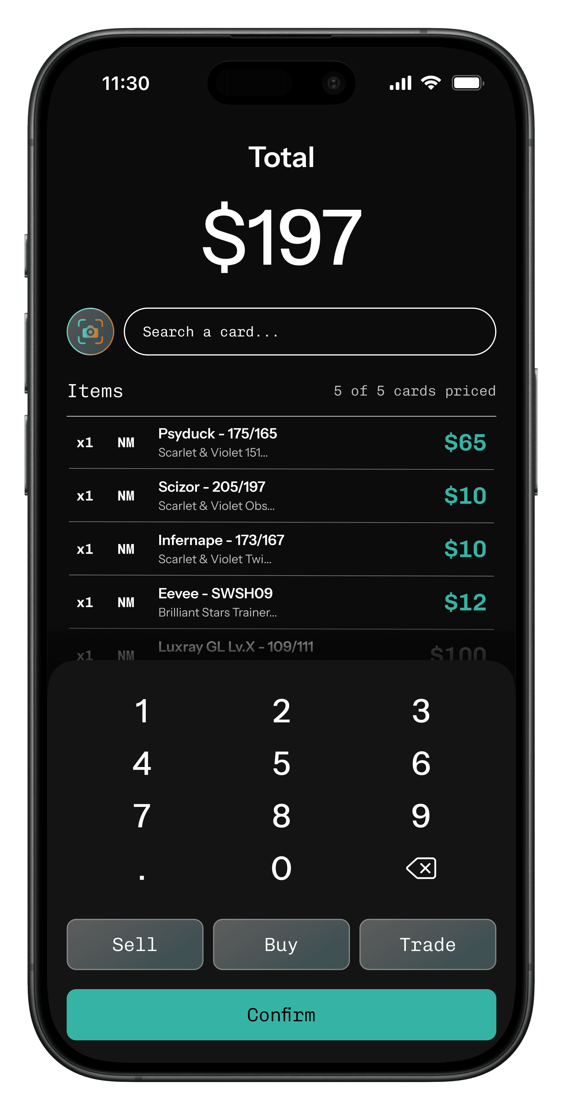
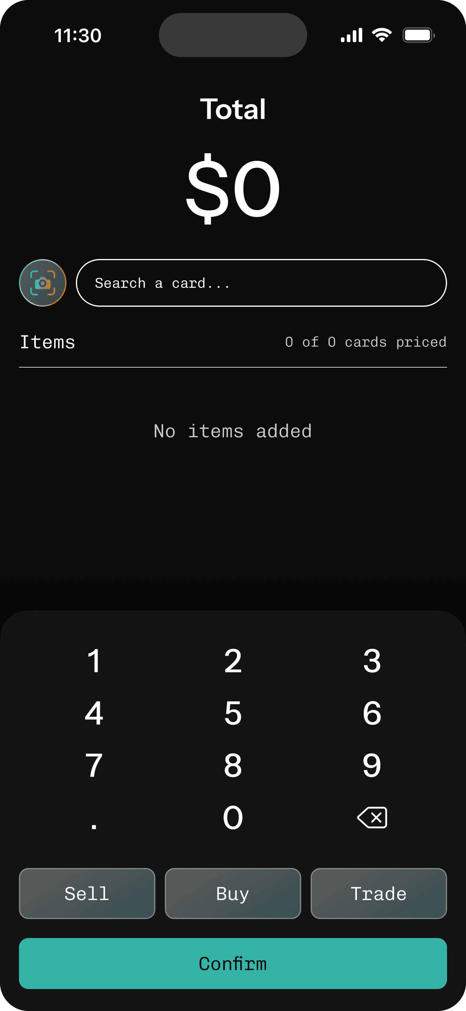
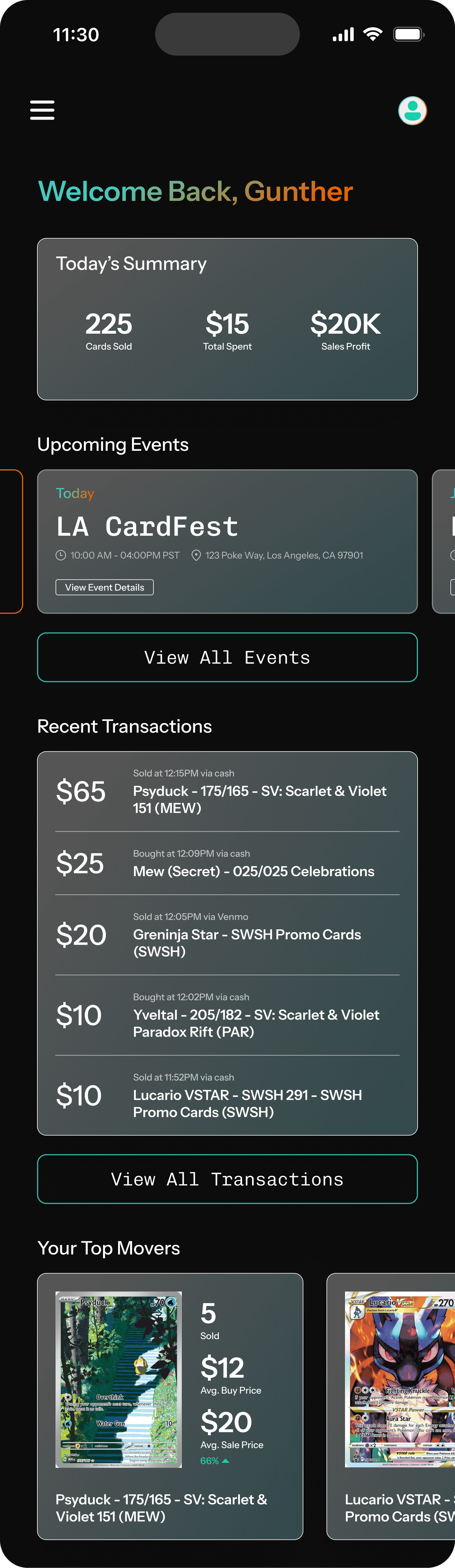
Below is how we approached our main flow-logging a sale transaction:


We learned from MVP testing that logging transactions was still too slow for vendors
To move beyond our initial MVP, we took a closer look at how vendors actually use the app during a live show. Through direct feedback of 5 test vendors, we identified key friction points that slowed them down or prevented full use of the tool.
This led us to refine the core transaction flow by focusing on flexibility, detail, and decision-making support - without sacrificing speed. Below are some examples of vendor feedback and how it directly influenced improvements in our final designs.

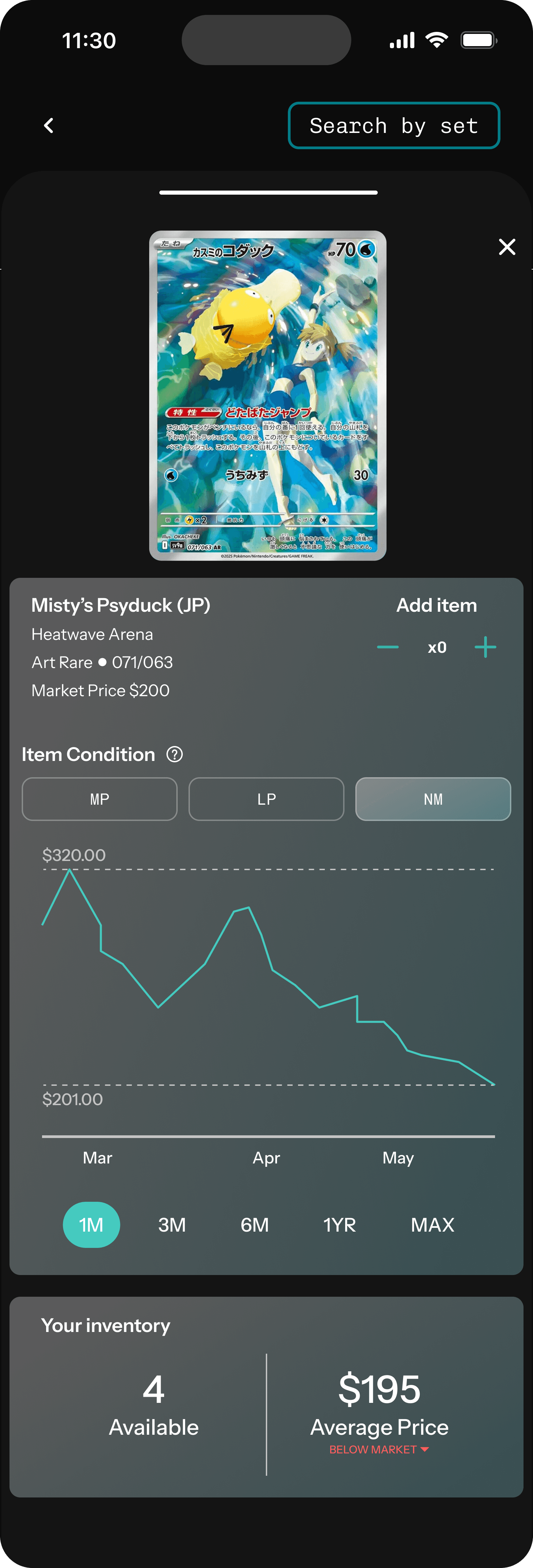
→ Added a payment method field to each transaction log to give vendors better post-show insights
→ Introduced a future-facing concept for real-time card data integration to help vendors comp prices on the spot.
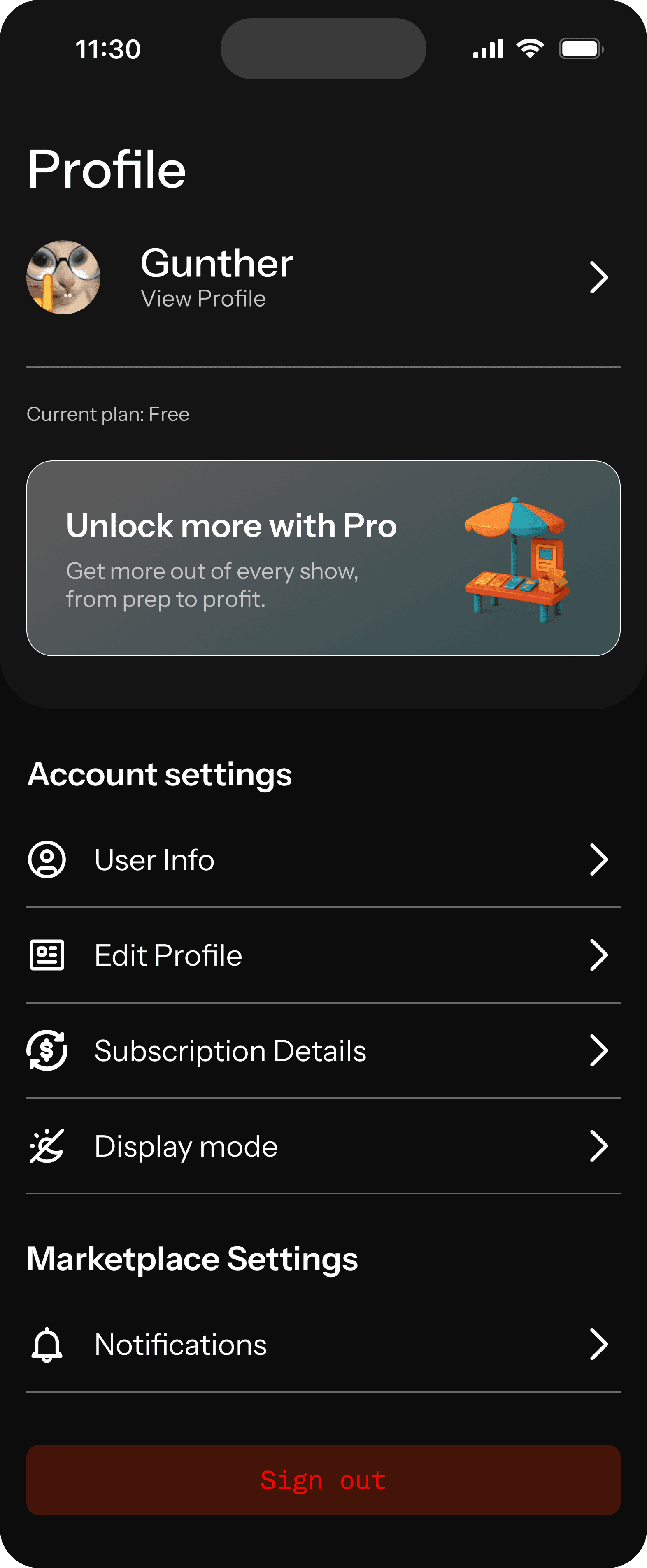
Additional key screens including ideas for potential feature offerings like marketplace to expand the possibilities of the app.

Impact & Next steps
Early traction starts with earning trust in the community.
While we're still early in the product journey, the response from the vendor community has been a strong signal of validation. Vendors were open, curious, and often excited about what we were building-because it was clearly made for them.
Even without formal metrics, we view this project as a success because of the conversations it started, the trust we earned, and the enthusiasm we saw from real users. It reminded us that when you design closely with your audience, impact starts early, and it sticks.
What's next
Now that we've validated the core concept and built a working MVP, our next focus is testing the intial vesions of our final app designs in real-world conditions. We'd love to re-engage with vendors from earlier conversations and attend upcoming card shows to onboard initial users and observe live usage.
We would prioritize:
Gathering deeper feedback
Refine high-friction areas
Learn what functionality drives repeated use.
In parallel, we would also scope out features for the next phase of the app - including inventory tools, lightweight analytics, contextual pricing support, and an open-marketplace. As we move forward, our focus remains clear: build the right product by staying close to the people it's built for.
Thanks for reading!