CEI WEBSITE REDESIGN
Designing a clearer path to care: Reimagining CEI's digital experience for seniors and caregivers
Overview
Partnering with Center for Elders' Inedpendence (CEI), our UX team led the redesign of their outdated website to help seniors and caregivers better understand their healthcare options through the PACE program. I collaborated closely with our lead UX designer to shape the research synthesis, page structure, and component system that would support CEI's goals of driving clarity, trust, and inquiries - all while creating a scalable and maintainable system for our agency's UI design and development teams.
Team
UX, UI, PM, Development
Role
UX design, research
Tools
Figma, Figjam, Zoom, Smartsheet
Timeline
2 months
01
The challenge
CEI's previous website left many potential participants confused. While their programs provided life-changing support for seniors wanting to stay independent, the digital experience failed to explain what CEI offered, who it served, or how to access care.
We needed to create a clearer, more supportive site that:
Helped users understand if they qualified for care
Conveyed low or no cost upfront
Built trust with both seniors and their family caregivers
Guided users towards action - without trying to decode a system themselves
02
My role & collaborators
I served as a UX designer on this project, collaborating under our lead UX designer to co-own the end-to-end process.
My key contributions included:
Conducting a full UX site audit
Mapping and sketching early wireframe flows
Designing a modular component system used across all page templates
Working with UI designers and devs to ensure smooth handoff and alignment
Presenting annotated wireframes to stakeholders and implementing feedback
This was a highly collaborative process, and I regularly partnered with PMs, UI, and engineers to move the project forward with shared visibility and clarity.
Research & Insights
Finding the gaps from focus groups and shared experiences of Bay Area seniors
We began the project by sitting in on focus groups conducted by our own internal research team, hearing directly from diverse cultural groups of Bay Area elders. Paired with an internal research report, we synthesized findings.
Our two primary user groups - Senior Self-Deciders and Caregivers - had overlapping but distinct needs:
👨🏽🦳 Seniors (Self-Deciders):
Want independence, not dependency
Skeptical of cost - unaware CEI is low/no cost
Had low awareness of what CEI or PACE actually offered
Worried about giving up control of their care
Motivated by vitality, connection, and self-agency
👤 Caregivers:
Needed clear info to feel confident making decisions for others
Seek clarity on services and outcomes
Wanted assurance their loved ones would stay safe and engaged
UX Strategy
Establishing a framework that helped us decide what content was worth keeping
We began with a complete site audit, identifying friction points and missing content. We then ideated and sketched a new site structure grounded in users' core questions:
What is CEI and what do they offer?
Who qualifies and how much does it cost?
Can I keep my current doctor?
How do I take the next steps?
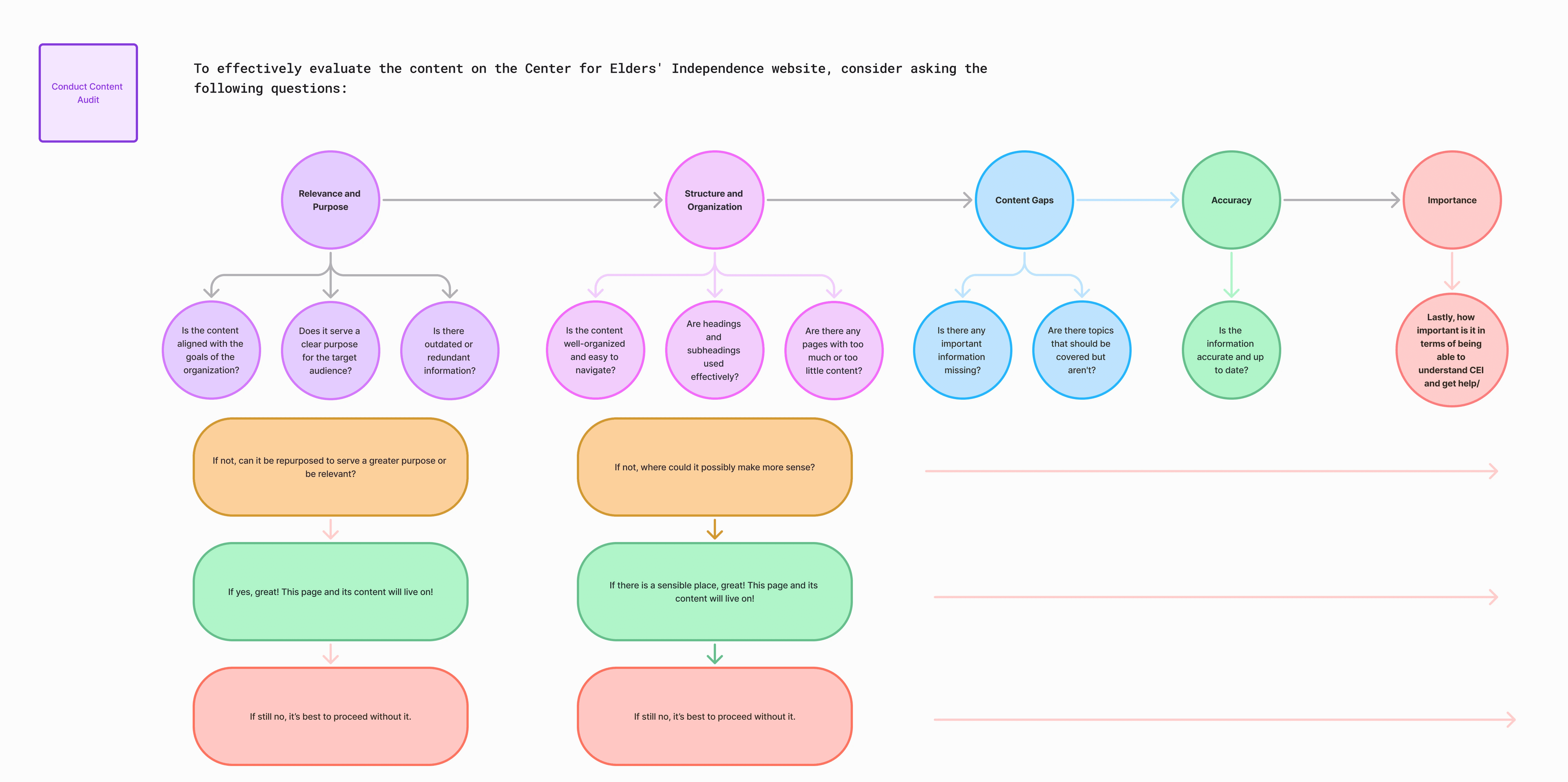
My design lead and I used this framework to evaluate each page’s relevance, structure, and accuracy. It helped us identify what to keep, revise, or remove—ensuring all content supported user needs and organizational goals.
Laying the foundation of scalable design
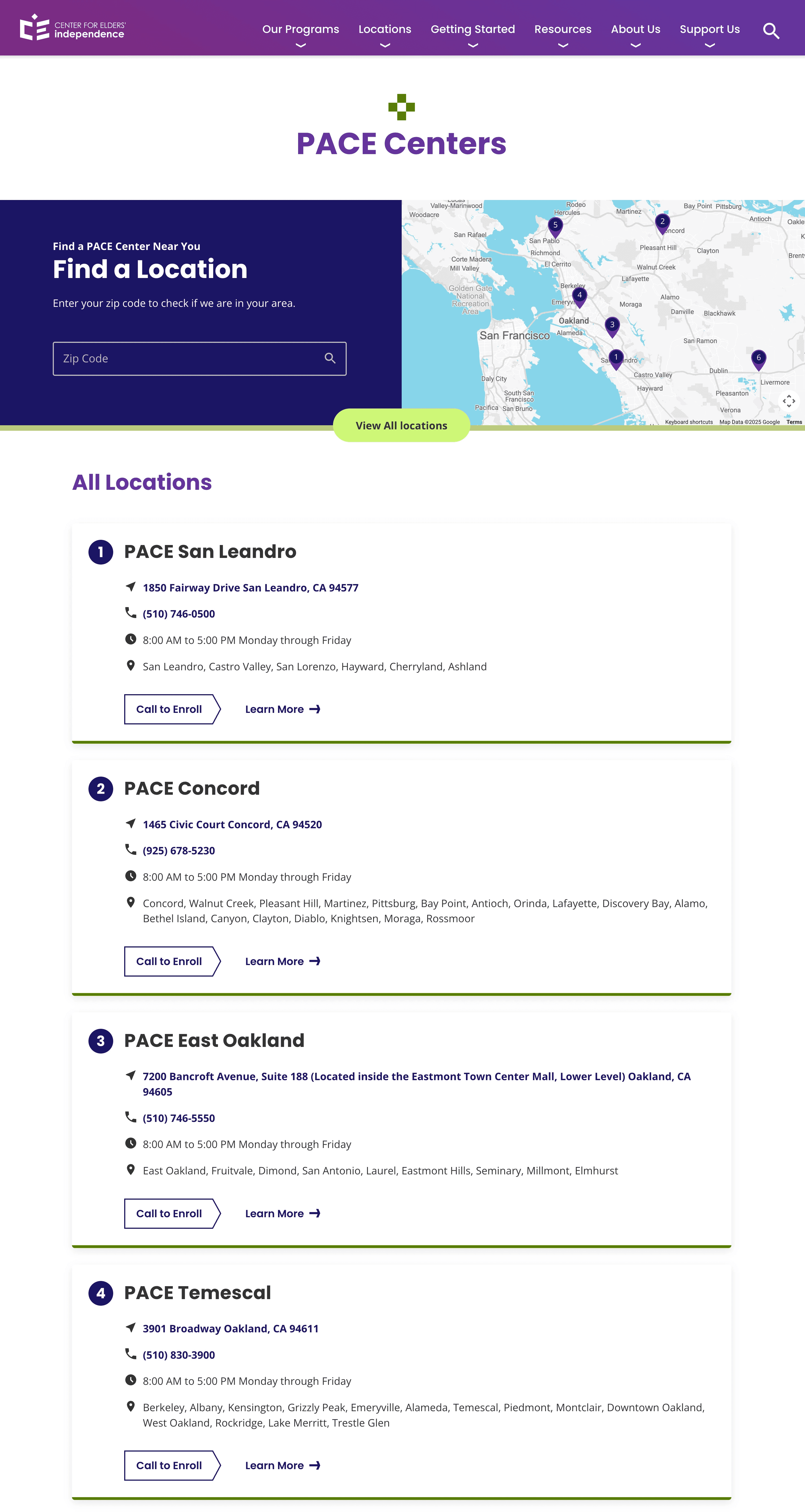
To support a scalable design and consistent development, we built a modular component system - a collection of reusable sections that could flexibly serve different content across pages (e.g., image + text blocks, expandable FAQs, map locators, content tiles, etc.).

This modular system gave our UI team a clear starting point, helped the dev team assess feasibility early, and allowed stakeholders to visualize how content would come together on the final site.
Helping users understand CEI at a glance, and turn curiosity into action
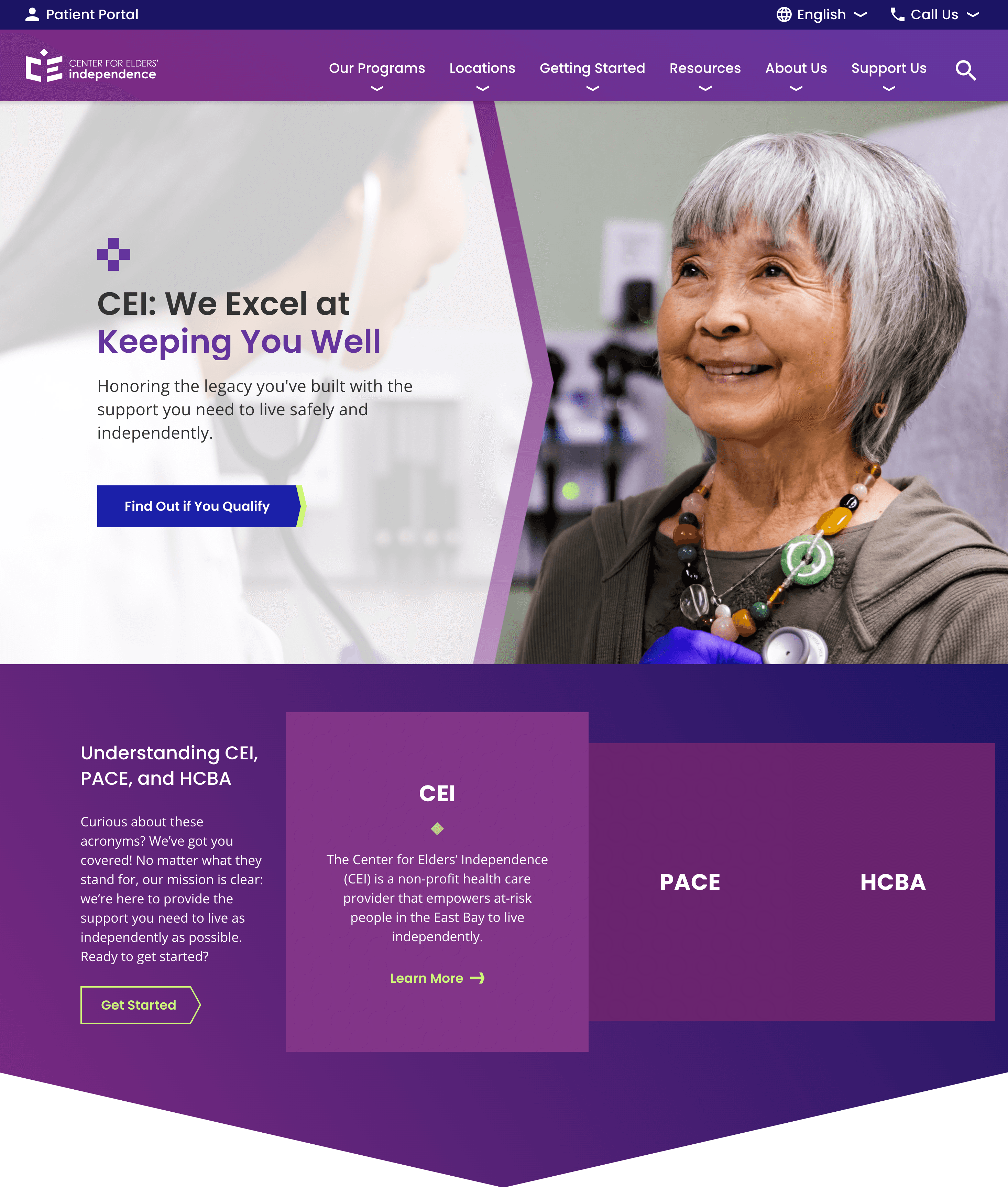
We restructured the homepage to immediately answer the biggest user concerns and support their decision-making journey from ad click to inquiry.
The initial concept we proposed for below the hero section of the home page, clarifying confusion between the organization itself, and the certain programs CEI offered.
Our UI teams final design developed into the live site
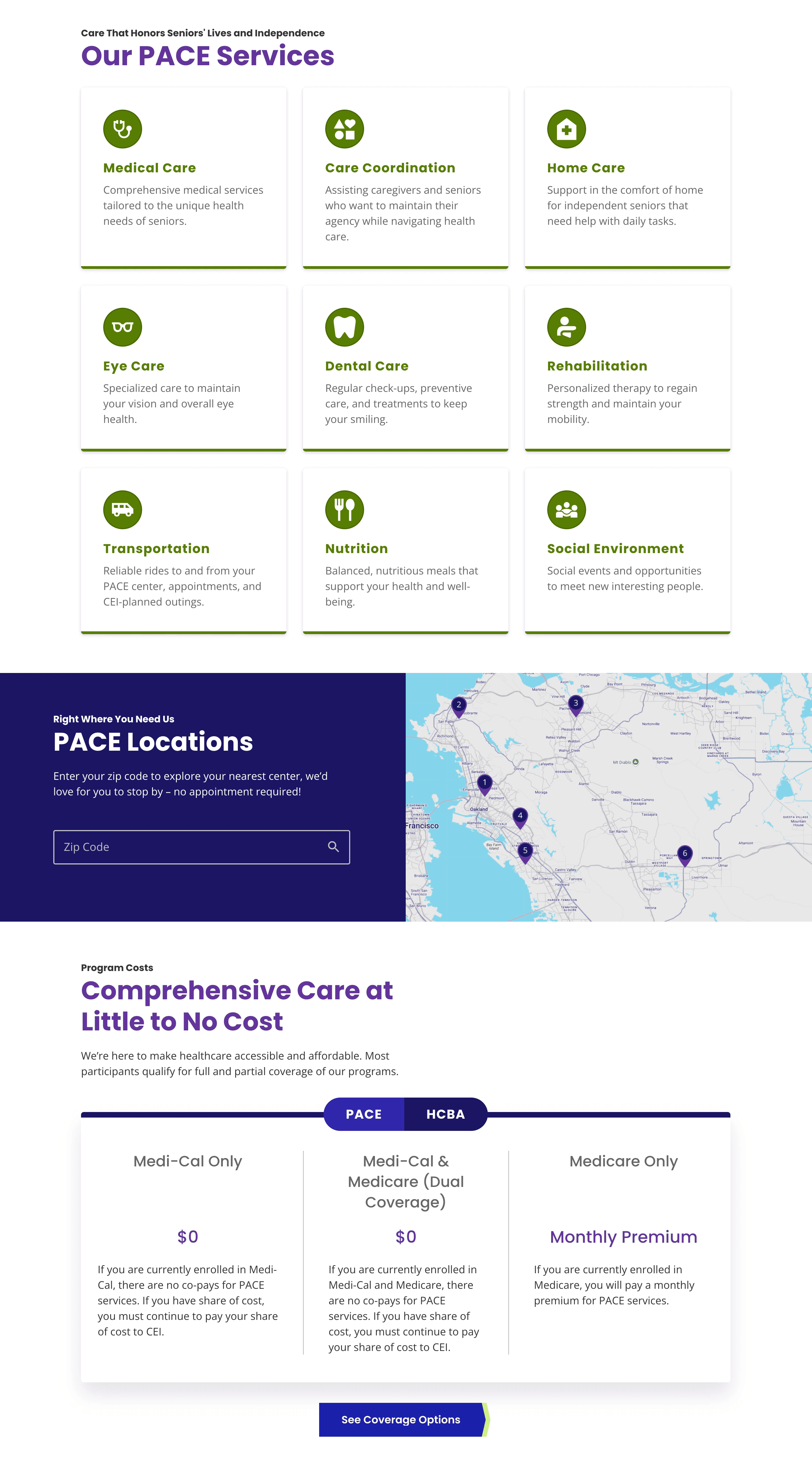
We introduced a tabbed cost breakdown on the homepage to simplify complex pricing details by program. This helped users quickly find the information relevant to them without navigating away or getting overwhelmed.
Our UI teams final design developed into the live site
As our wireframes took shape, we worked hand-in-hand with our UI designers to theme the site and ensure accessibility, clarity, and brand alignment.
Our modular approach allowed for fast, coordinated design and development. I created annotated wireframes and maintained Figma comments to support implementation clarity and close feedback loops.
We held regular check-ins with our PM and devs, presented to stakeholders, and incorporated feedback efficiently. The client's trust in our process helped us launch without and major revisions.
Outcomes & Reflections
Launching a site that brought clarity to and confidence to seniors and caregivers alike
The redesigned CEI site launched successfully in early 2025 and was well received by both clients and stakeholders. Our content and structure were acknowledged - helping demistify a complex but vital care program for Bay Area seniors and families.
Impactful wins:
Reduced friction by front-loading cost and eligibility info
Simplified caregiver decision-making with clearer navigation
Modular design supported rapid, aligned production across 10+ pages
Client launched the site with almost no changes to our original UX structure
This project strengthened my skills in component-driven UX design, health literacy, and designing for dual-audience experiences. It also showed how even simple structural changes can create powerful real-world clarity.
What I'd do differently
While our launch was successful, I would've loved to track post-launch metrics or conduct usability testing on the live experience to indentify any ongoing friction or missed expectations.
Thanks for reading!